Branding for yoga studio in central London. In the hub of London’s bustling, jostling business scene is a haven of peace and tranquility. A place where you no longer feel rushed and hemmed in; where your stress can melt away and you feel like a bird soaring through peaceful landscapes.
Logo inspired by conscious, connected breathing (prana means breath); the awareness of the cycles of breath moving in, and out, of the body.
Unfortunately this is not the route the client decided to go but I like it so here it is…
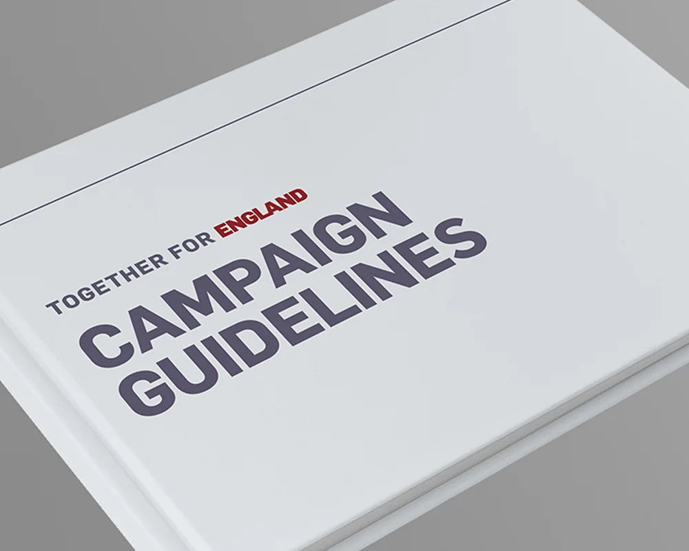
I designed and co-wrote the Together for England Brand and Campaign Guidelines. As part of the guidelines, over 500 partner lockups were created and delivered to all of England's corporate sponsors and partners.
Targeted campaign – posters, postcards, email and bus signage – for Mental Health Awareness Week.
The first of five projects I have worked on with LEGO over the past year (including their Leadership Manifesto Project and branding for two SMT partner programmes).
As all are confidential only the Playbook and Manuals will be visualised on my website, with all copy changed to Lorem Ipsum.
I worked closely with copywriters and senior designers at innocent to produce over 30 different outdoor, POS, adverts and digital assets for their October/November Super Smoothies campaign.
In June 2017 I produced the branding for the Under 21's team hotel in Poland for their stay during the Under 21 European Championships. The branding was extremely well received by clients in The FA as well as coaching staff and players.
Using innocent’s campaign guidelines and working with copywriters and senior designers, I produced several of the innocent big knit’s outdoor assets including 240 sheets, bus shelters, a bus t-sides and luas columns.
I conducted a thorough investigation and audit of the brand and all collateral for print and online. The brand had been adapted and new sub brands had been created across the board. I developed a brand evolution and created the 95-page Brand Guidelines, with templates for internal and external use.
I did the branding for the England Senior Women's team base camp hotel in Utrecht, The Netherlands. This 20 metre long aspirational floor graphic tells the story of the qualifying campaign and is peppered with important wins and successes that happened along the way. It takes you on a journey through through the group stages, quarter finals, semi finals and then the final, with the ultimate goal of the trophy at the end.
Our camera picked up the texture of the vinyl a lot more than was visible on the floor.
The feedback from clients on the ground is that the staff and players loved it.
Every year innocent drinks teams up with Do Nation to reduce their CO2 footprint. At Fruit Towers teams are divided by floor in a competitive bid to make as much of a difference as possible.
Always fun and highly competitive, innocent drinks always proves to be one of the companies with the most pledges.
I was really happy to play a part in the creation of the 2018 internal campaign collateral.
The second of five projects I have worked on with LEGO over the past year (including their Leadership Manifesto Project and branding for two SMT partner programmes).
As all are confidential only the Playbook and Manuals will be visualised on my website, with all copy changed to Lorem Ipsum.
Using innocent’s campaign guidelines and working with copywriters and senior designers on a wide range of products, I have created several adverts, billboards, postcards, T Sides and more for innocent drinks. A few examples are shown here.
Identity and branding for a start-up copy collective.
Identity alludes to hyper-simplified, graphic, Greek alphabet letters. And although the design lends itself to 'reading' exactly the same way backwards as it does forwards, it is purposely not so.
Because palindrome is not a palindrome.
Heilene and Amy asked me to design a digital invitation for their wedding on Battersea Barge. I provided them with one for the afternoon ceremony and one for the evening celebration: the invite was the same apart from the wording and the position of the setting sun and sunset colours.
The Thank You card was printed so that their guests would have a personalised keepsake.
Identity and branding for start-up training company, Siphelele. Branding illustrates not only the three core values of the company forming a unified whole, but also the three pillars, or constructs, that form the basis of their methodology. It also also showing the individual, depicted by Zulu beads, as being integral to the whole.
Siphelele means ‘we are whole’ or 'we are one' in Zulu. I also recommended the name for their business as the name they had chosen was too corporate and dry: it didn't align with them or their values.
This is the branding I did for the England Media Centre in Chantilly. I branded 12 rooms in the England Media Centre which told the story of England’s qualifying campaign.
I won the Spinnaker Annual Report pitch for the agency and subsequently produced the reports for all three Spinnaker funds for the next five years. Whilst flowing in copy I noticed several inconsistencies and, after having presented them to the client, I worked with him to develop a copy style guide which HSBC and PCWS now use when pulling together content for the reports.
Spinnaker wanted to have reports which were smart and elegant with a hint of sophistication but also understated.
These are some pieces of stadium branding that were produced as part of a larger rebranding of the stadium concourse and St George's Park. The first is a segregation gate banner which creates a welcoming atmosphere for fans as they enter through the turnstiles.
The 105-metre pitch banner of England football legends, current players and fans is displayed at the start of all England home games.
Below is the branding at St George's Park, the England training ground.
I was sent out to Rio de Janeiro to oversee the branding for the England team hotel and media centre. We branded seven rooms at the England team hotel and another seven at the media centre.I was pulled onto the project at the last minute as the team was very far behind schedule and there were serious concerns about the information and capabilities of the team in Rio. I was sent to Rio for four days two weeks before the tournament began to sign off print nothing had been printed. It was an exceptionally trying project with innumerable challenges but in the end, The England Media Centre, set at the base of the iconic Sugar Loaf Mountain, was hailed as the best of all participating teams
Save the Date and Wedding Invitation. Printed on 350gsm Colorplan and duplexed effectively creating a 700gsm board with a white and green split core.
EMpower connects the emerging markets community with local organisations providing tools and resources to enable at-risk young people to lead healthy and productive lives. I evolved their brand across print and digital. This is their new website which reflects their core focus on youth in emerging market countries.
A few of the assets I created and supplied as part of the brand evolution and brand guidelines that I created for The Royal British Legion.
To mark their 10-year anniversary, the Arboretum produced their first annual review, which looked back on the organisation’s achievements since inception.
The National Memorial Arboretum is the UK's year-round centre of Remembrance; a spiritually uplifting place which honours the fallen, recognises service and sacrifice, and fosters pride in our country. It is a living and lasting memorial. After redesigning their website I designed a 160-page pictorial guidebook to the memorials on the 150-acre national park site.
Initially the NMA came to us asking for a minimal update to their current website. The website was however, was not reflective of who they are and how they spoke of themselves. The words "living memorial" were mentioned often yet the website was white and beige. Equally, considering that many of their visitors are elderly the narrow single column of very small text down the middle was not very accessible or easy to read.
I encouraged them to revamp their entire website to better reflect their vision and values of being the UK’s year-round centre of remembrance. I designed a colourful, picture-led website which was so well received by the client that we subsequently won all of their future design work.
EMpower’s annual review colourfully celebrates the diversity of the youth with whom they work.
Identity and branding for oil and gas company in Nigeria.
Strong Rock wants to be perceived as corporate and established yet contemporary.