
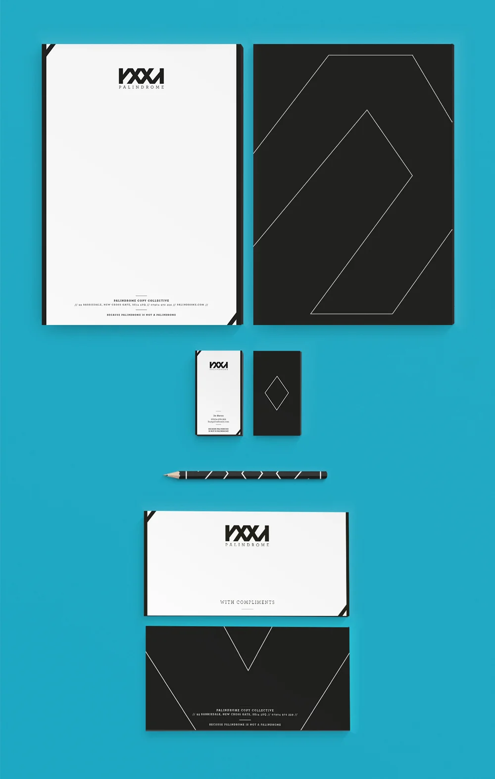
Identity and branding for a start-up copy collective.
Identity alludes to hyper-simplified, graphic, Greek alphabet letters. And although the design lends itself to 'reading' exactly the same way backwards as it does forwards, it is purposely not so.
Because palindrome is not a palindrome.